Timeline
April 2022 (1 week)
Role
UX Designer
THE PROBLEM
Users want to know how the product they are interested in stacks up with other products.
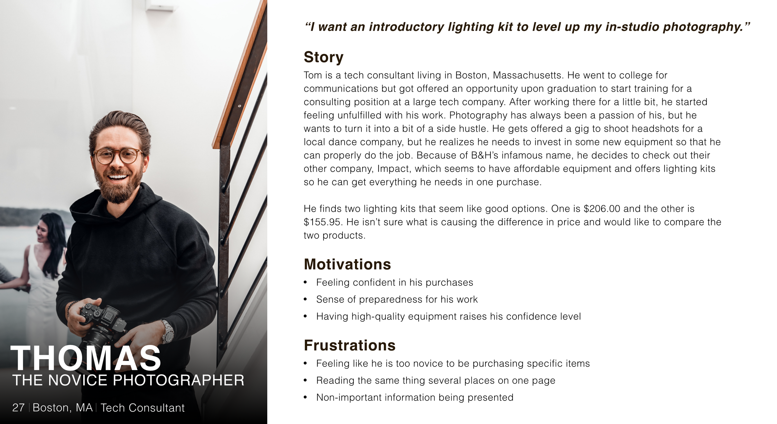
A novice photographer is looking to upgrade their kit by adding some lighting to their quiver. They spend a ton of time combing through Impact’s website and finally settle on two different lighting kits. When they click on one of the lights they are interested in, they are met with a string of numbers and letters and a clunky layout. This makes them feel overwhelmed and confused about what they are looking at. They now have to keep clicking back and forth between items to see how their two options stack up to one another. Before this redesign, users had to manually switch between pages and try to remember information about each product, which led them to feel frustrated and want to look elsewhere for a lighting kit. Shopping in this manner is inefficient, frustrating, and dull.
THE SOLUTION
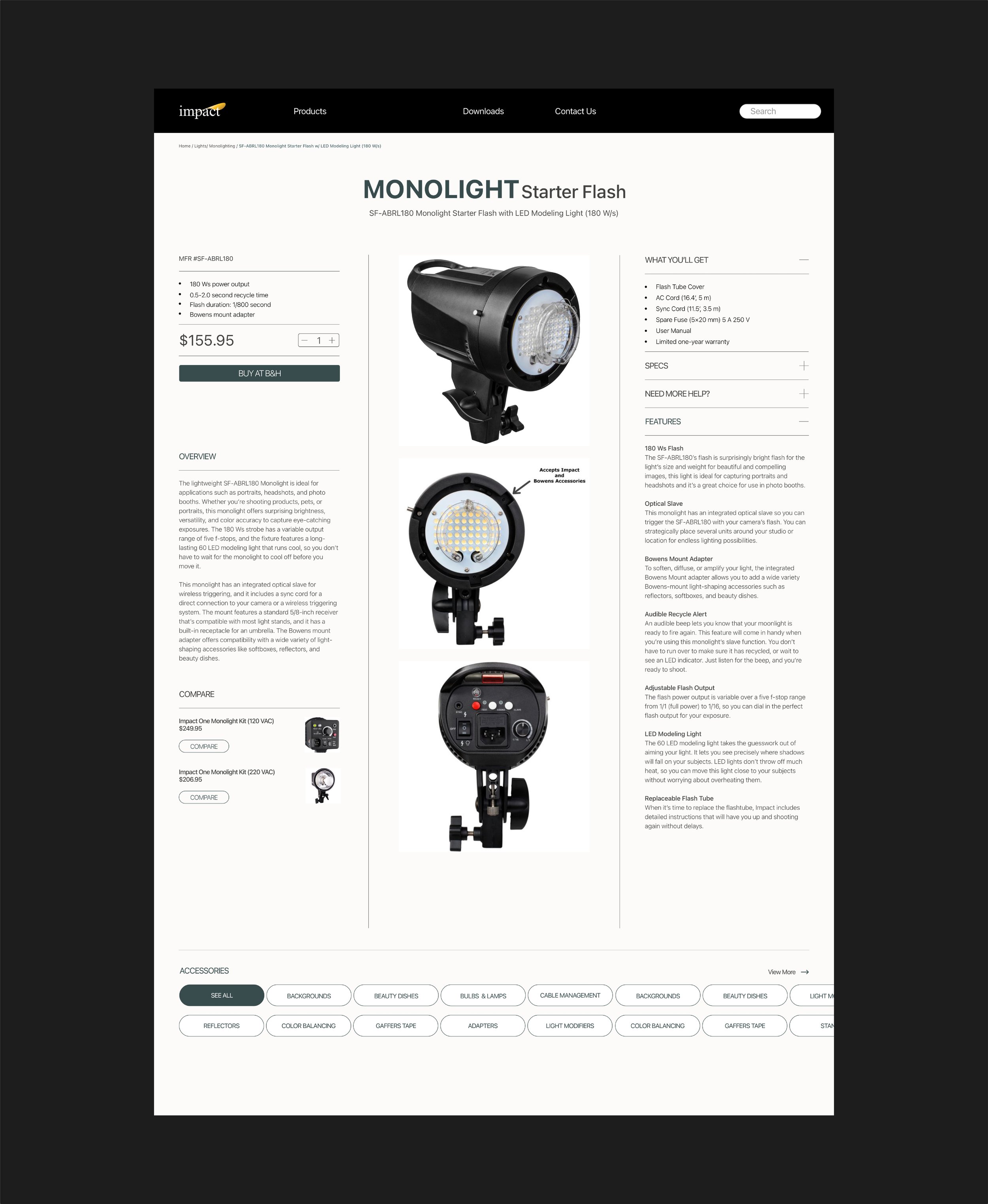
Create a compare feature and place it on a page that highlights and flatters the product.
OUR USER
RESEARCH & COMPETITIVE ANALYSIS
Just because it is tech equipment, doesn’t mean it can’t be presented in layman's terms.
I began my research by combing through countless e-commerce sites in many different industries, from car sales to beauty care as well as looking into direct competitors such as KEH, Adorama, Samy’s, etc. Through my research, two points stood out to me:
So many sites offer the opportunity to compare products, except for photography websites. These products aren’t cheap and users may want to take extensive precautions before purchasing an item. This seemed like a clear way to make Impact stand out above its direct competitors.
Most other industries put clear and concise titles on their products. The photography industry is still giving the entire title of the product as it would be in their system, but this can intimidate and deter buyers. Impact has a much more enticing title on their overview of the products, but doesn’t use that to list the product which feels like a simple fix that could yield large results.
DESIGN ITERATIONS
I conducted a preference test asking users which compare section they preferred.
Pulling inspiration from sites such as Behance, Dribbble, and Pinterest, I began making my initial layout focusing on the insights I gained through my research.
FINAL DESIGN
NEXT STEPS
The next steps for the product page would be to user test, to solidify that the pathing, layout, and copy all line up to make an intuitive experience. Once the tests have been conducted and the necessary improvements have been made, all assets will be neatly packaged and sent for development.
Thank you for reading!
Please reach out to budrispat@gmail.com for more work inquiries


